Daly
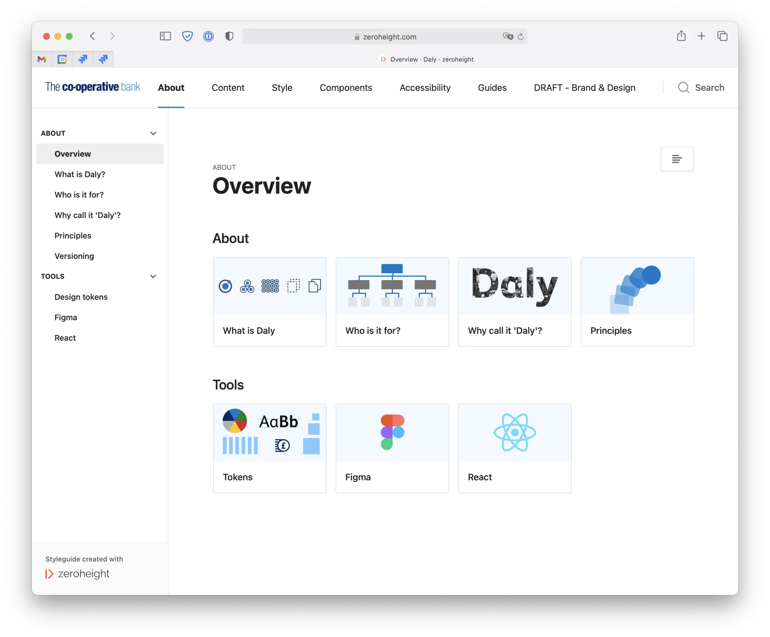
The Co-operative Bank's teams were organised by platform, not product, so the same components got rebuilt differently on every surface. Daly is the design system I led to end that: tokenised, accessible, and adopted without a big-bang switchover. Still in use across the bank years on.
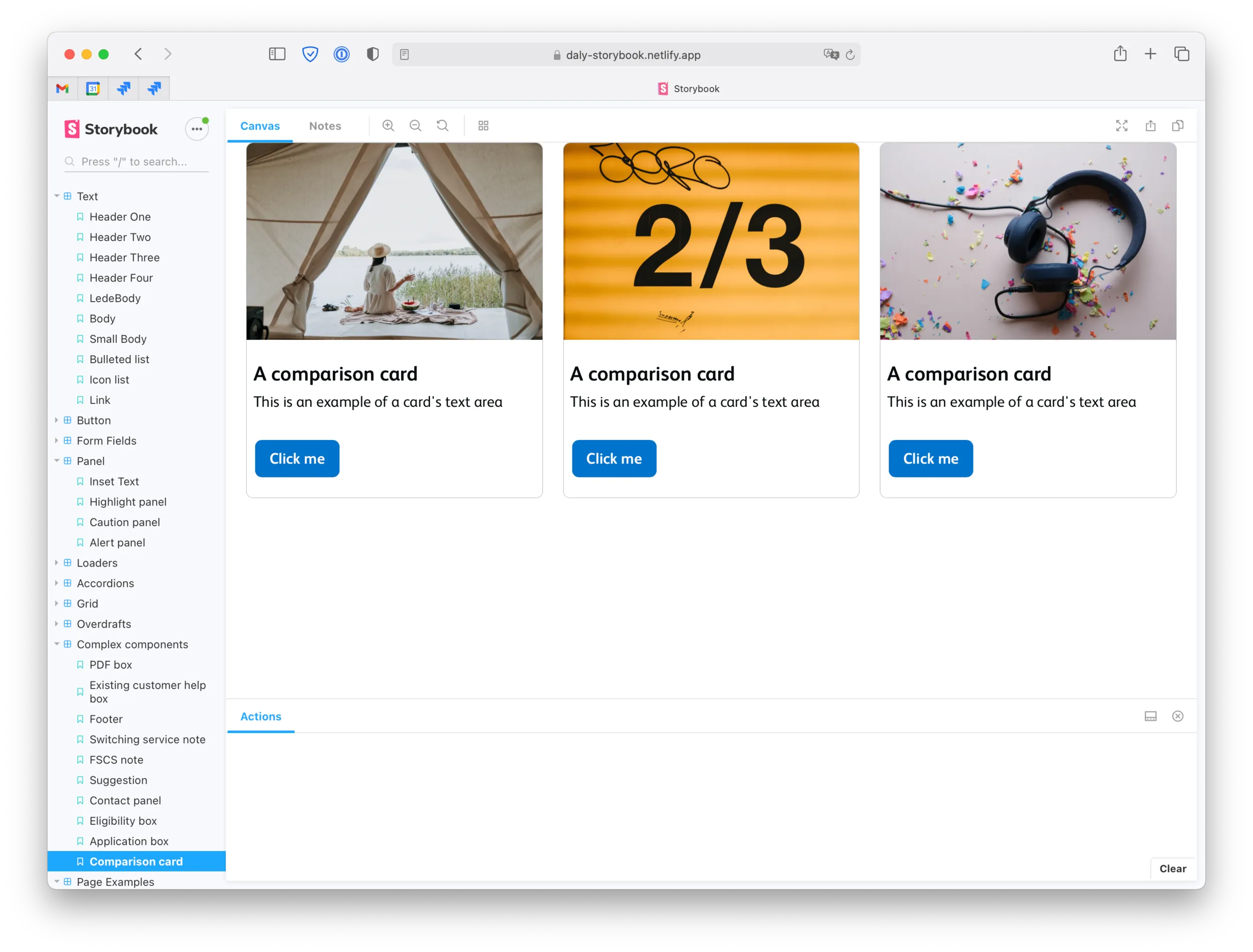
The same button, rebuilt on every platform
The Co-operative Bank was founded before the telephone existed, and parts of its digital estate felt it: some pages hadn’t really changed since the 2008 crash. The deeper problem was structural.
The bank’s scrum teams were organised by platform, not by product, so the same feature got built and rebuilt separately for the web, the mobile app, the sales pages and the servicing pages, drifting apart a little more each time.
When I joined, a colleague, Shane, showed me a vast Figma page he’d kept of every place a single component (a button, say) looked or behaved differently across the bank. Everyone could see the mess. Nobody had a way to act on it. And in financial services that mess isn’t cosmetic: with an older, banking-dependent customer base, inconsistent and inaccessible pages do real harm.
To cap it off, our hosting provider was shutting us off within months, so whatever we did had to be ready for a site migration on a brutal timeline.
Build the system, don’t force the switch
The obvious move under a deadline is to re-skin the pages you have to migrate and ship. Building a proper, tokenised design system instead wasn’t an easy sell. systems are long-term infrastructure, and we had weeks.
What made it safe was refusing a big bang. We designed components and patterns that could fit every surface and stack, but we didn’t demand that every team switch over at once. Some hopped on immediately (business banking were mid-rollout of a new frontend and app, so the timing suited them); the personal-banking app came later after clearing a roadmap months long.
A mismatch in two months is no worse than the mismatch today, and meanwhile the foundations exist for whoever’s ready. The groundwork rode on previous audits and the teams’ own: each audited its surface and fed it up, which told us the minimum set of tokens and components we actually needed, and which odd bits were fine being left outside the system for a while.
Tokens, Storybook, and accessibility
By month two I’d built the component library in React with styled-components and Storybook, pulling styling and formatting from a token system so one definition could feed every surface.
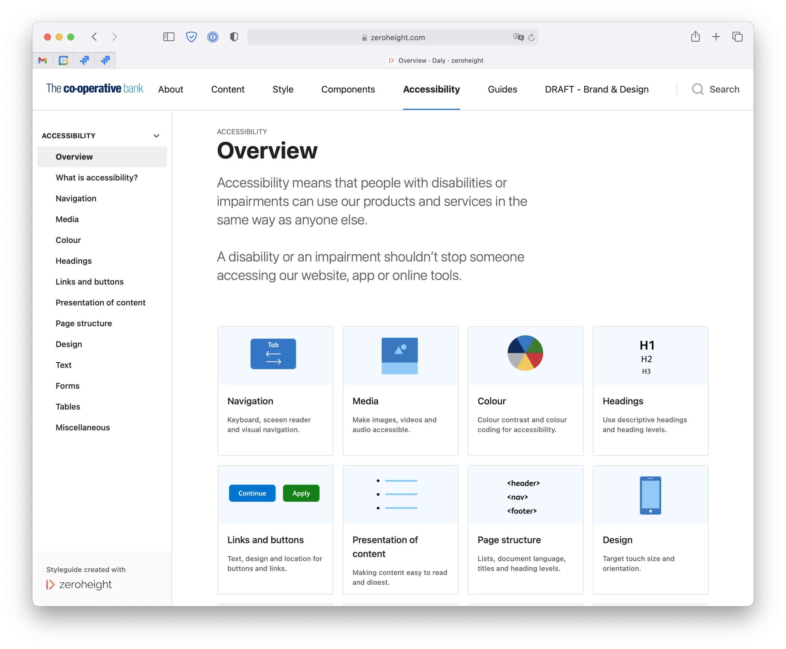
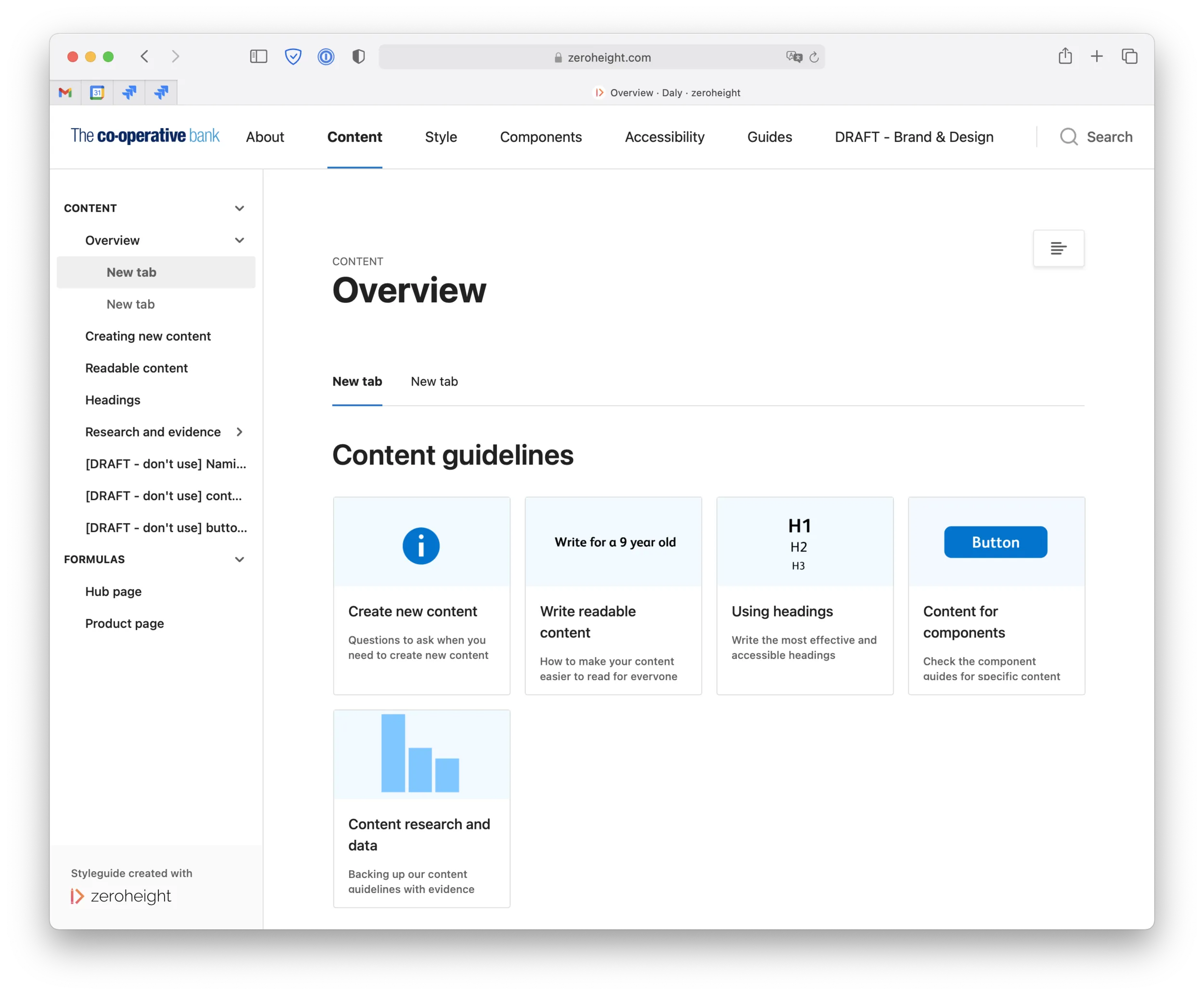
Accessibility wasn’t a bolt-on: alongside the obvious contrast and type-scale work, we wrote real guidance on accessible content and on choosing accessible imagery, the sort of thing that matters most for exactly the customers banks tend to forget. The result was extensible and maintainable, and (the entire point of the exercise) mutually intelligible: developers, designers, content executives and managers could finally build the same thing the same way.
What I led, and who saw it first
I led the formalisation of the design language and built the component library, and I named the thing after James Daly, a joiner who built the first co-operative business out of recycled materials. The inconsistency itself wasn’t my discovery; others had been documenting it for ages.
My job was to turn something everyone could see into a system they could actually use, and a realistic path to adopting it, working alongside product owners, content designers and developers throughout.
Still in use, years on
Daly is still the bank’s system, and you can still browse it on zeroheight. As far as I know it’s reached every touchpoint now, including the slow ones, and other designers have since refined it and put it in their own portfolios. It’s long outlived me at the bank.
Tools: Figma, React, styled-components, Storybook, zeroheight.