Credit Cards
Credit card team decides it's refresh time. I built a four-week sprint that collapsed sign-off from a wall of meetings to about a day, running user-centred design inside a 4,000-person bank without it turning into post-it theatre.
A refresh nobody had asked users for
An unglamorous truth most case studies hide: there was no user problem. No drop-off data, no complaints (or at least no more than usual), no competitor analysis sitting in a drawer. The higher-ups just wanted the numbers to go up. So the ‘brief’ was to carry over good practice to ‘ordinary’ work. Do user-centred, rigorous design-led change inside a 4,000-person bank, on a refresh that came with no user mandate at all, with three separate risk auditors, legal watching like hawks, and a sign-off process that could swallow months, and somehow don’t let the whole thing turn into design kabuki for moving a button around.
Post-its for risk auditors
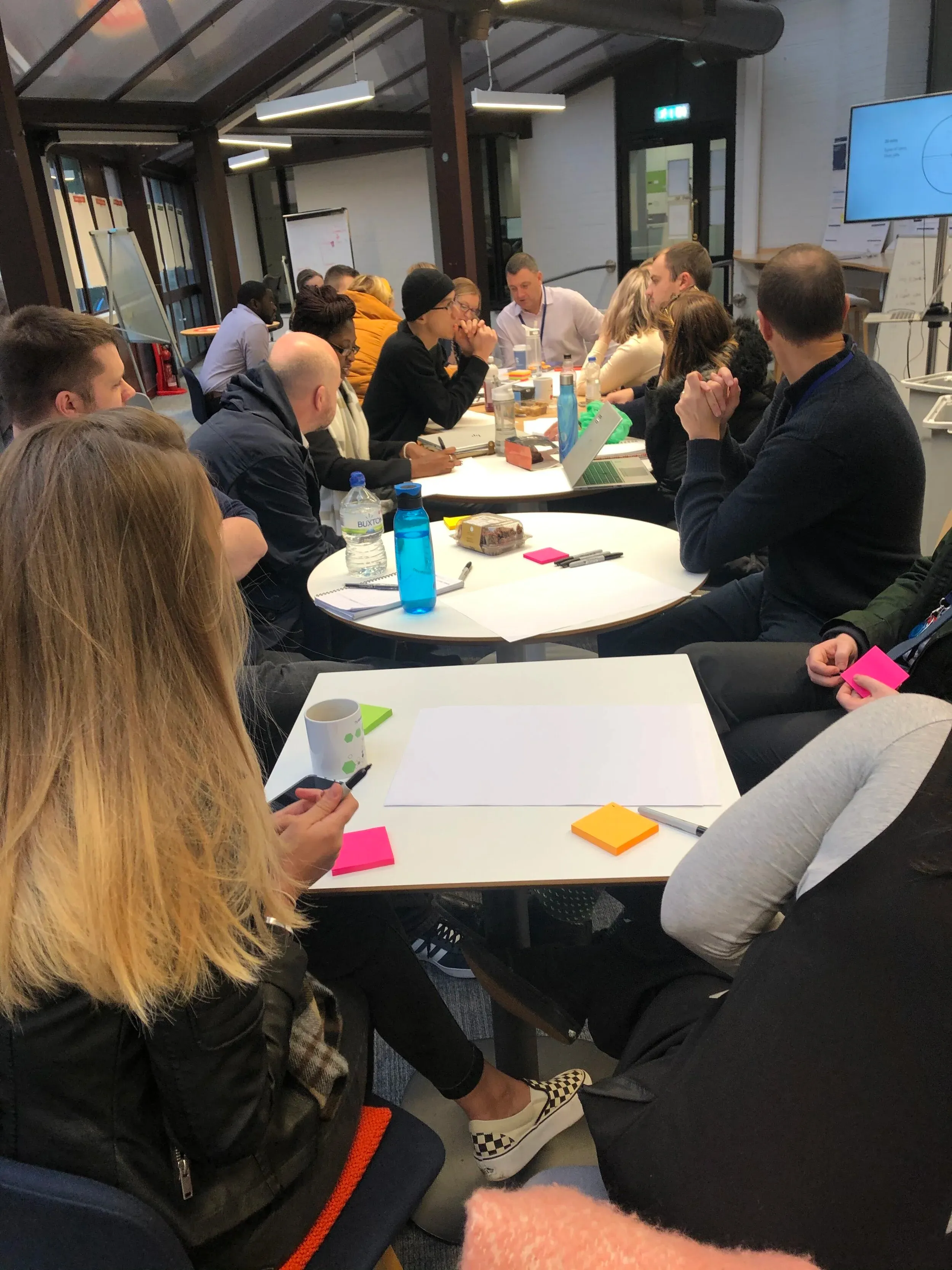
My proposal was a four-week sprint that pulled every stakeholder in at the point they were actually needed, rather than at the end to say no or demand changes. The harder part was that the people in the room were deeply suspicious of it. These were not post-it, ‘ideation’, put-Haruomi-Hasono-on-and-sketch-on-paper-for-ten-minutes-in-silence people. They had direct lines to very serious numbers and a very serious regulatory apparatus, and they were used to designers working away in Figma and gathering feedback by email or over the shoulder. Sitting in a room writing on sticky notes and role-playing as different customers felt new, and probably a bit like a joke.
So I adapted, mostly in the gaps between the work. Lots of one-to-ones after the workshops: catching the person who’d said nothing all session and giving them a private channel to the design team before anything got committed as done.
And daily check-ins, which I personally am not a great advocate, were a deliberate concession: a door people could always knock on to see progress. Once they saw the work was serious, and that they could shape the real thing and not just the pretend thing, they quietly stopped turning up.
A four-week machine for agreement
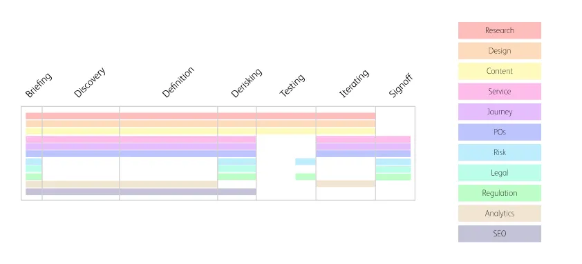
The craft here was in the process, and in the small instruments that made it fair. The week was built so each team contributed where they were strongest: a briefing day mapping everyone’s knowledge onto personas and journeys, then discovery, definition, derisking, testing and sign-off, each with its stakeholders booked in at the right moment.
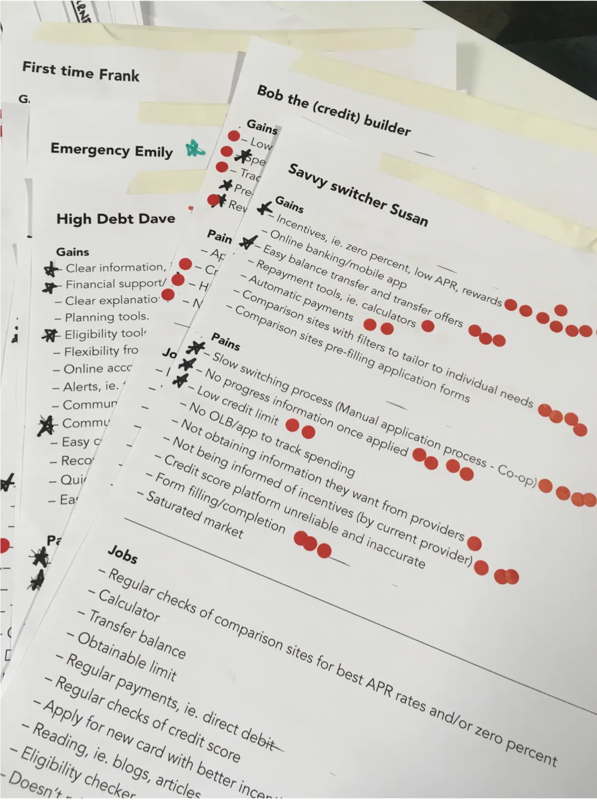
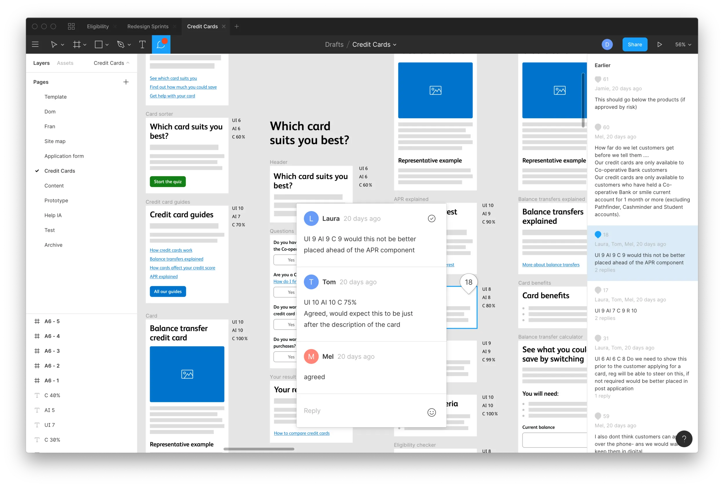
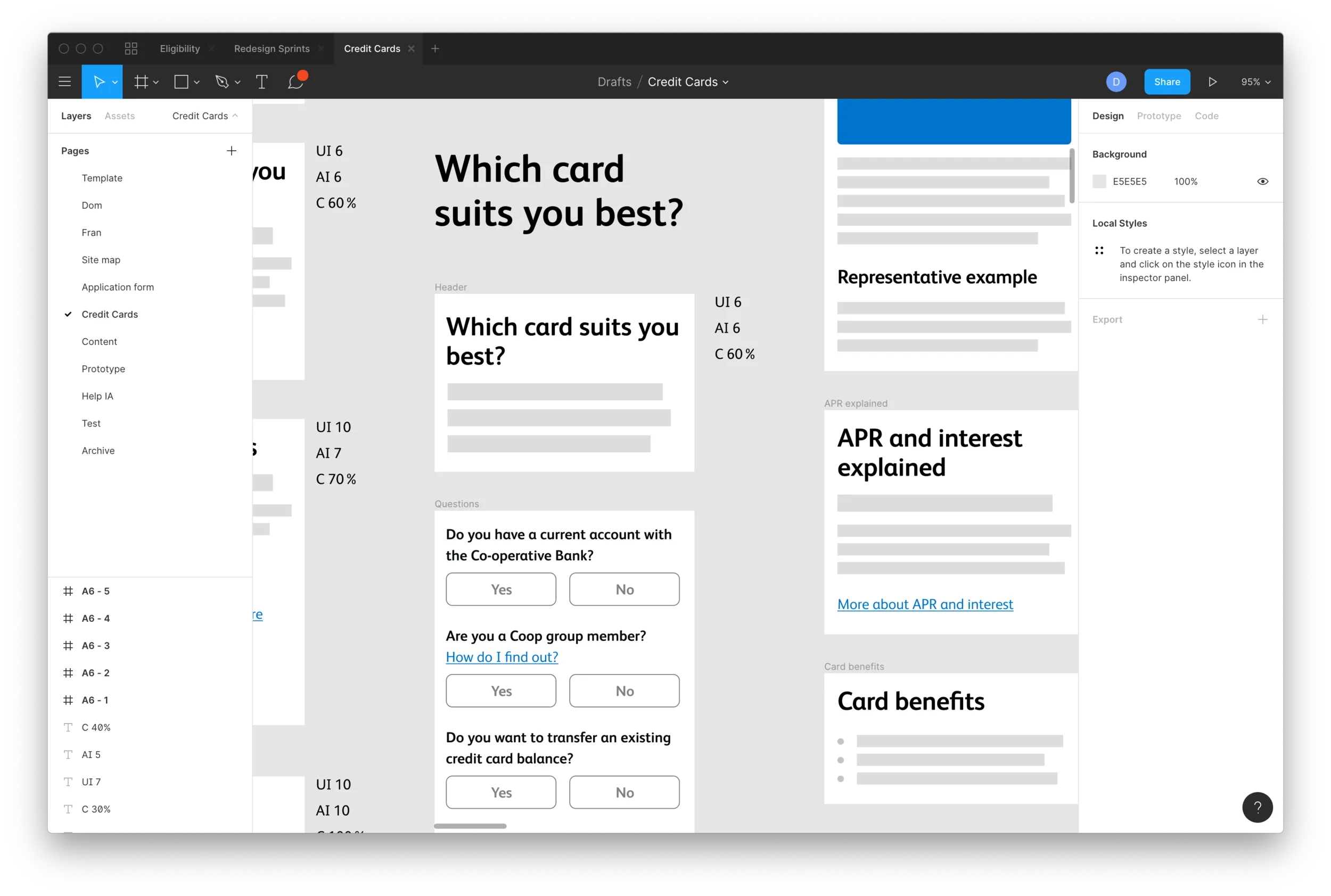
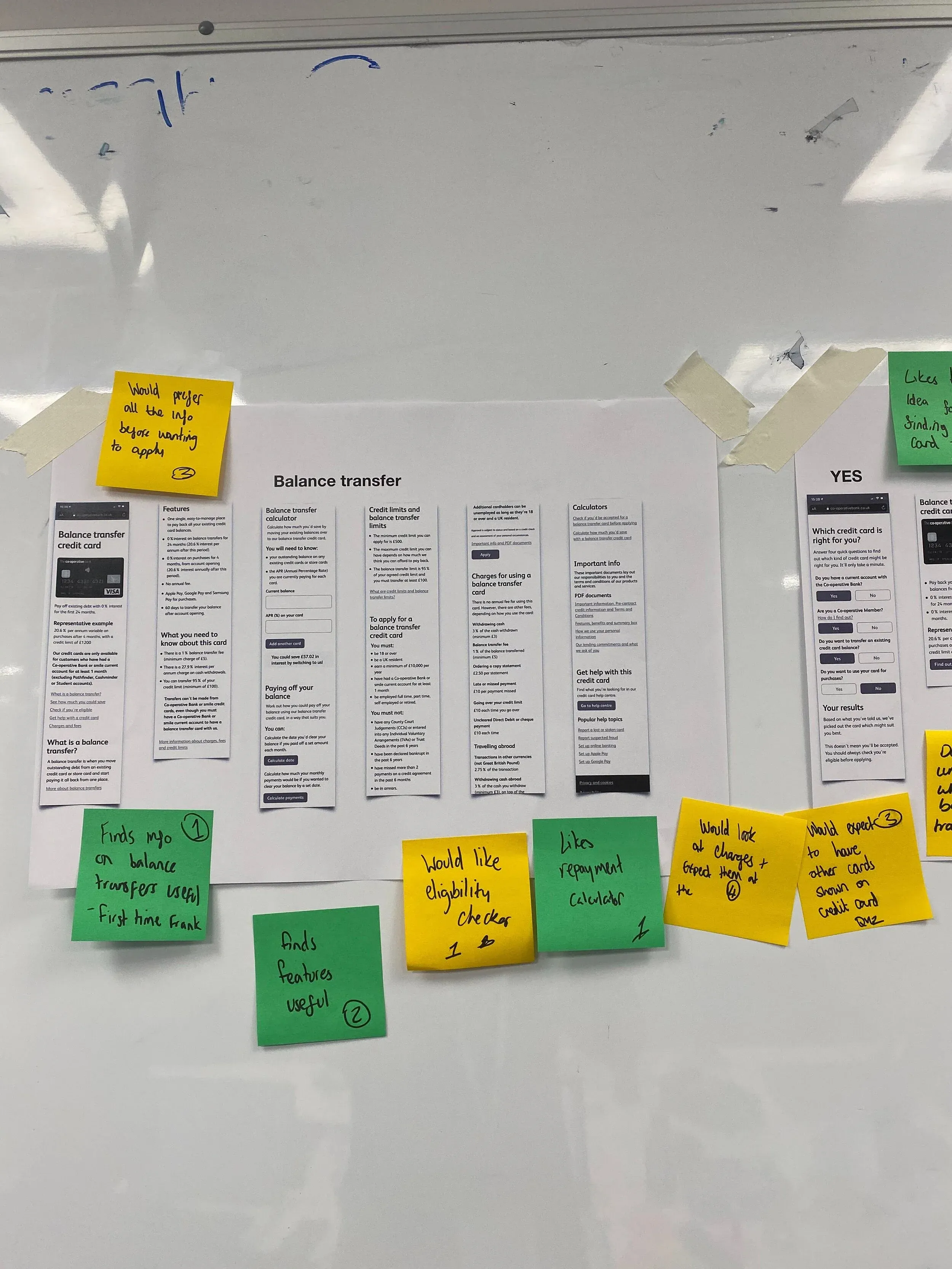
Instead of the loudest voice winning, everyone scored each component on three scales: how important it is to a given user, what the impact would be if it vanished, and how confident they were in both. That gave us collective confidence per component, flagged exactly where teams quietly disagreed, and told us precisely what to put in front of real users. We gathered hundreds of structured comments this way, then tested the rest in our UX lab and across thirty-odd remote sessions, mocking pages up fast with the wireframe kit from the Daly design system.
The team, and what I ran
The core team was three: me, a user researcher and a junior UX designer, with about a week to plan it all and brief it. I designed the sprint, facilitated the workshops, built the feedback frameworks and ran the project; the researcher led the user testing and the junior designer worked alongside me on the wireframes. We finished with a retrospective run by a delivery team’s scrum master, deliberately, so the reflection wasn’t ours to spin, and used it to cut a slimmer two-week version for smaller products.
Institutional experimentation
It shipped basically at the same time as I left for Germany as COVID hit. At a bank the size of Co-op, credit-card regulation is so tight that the journeys are nearly set in stone; chase a conversion uplift and you’re optimising statistical noise.
The thing actually worth moving was the bureaucracy. Because legal, the BAs, the PMs, risk and content had been part of the work the whole way through, sign-off went from what previously felt like ten thousand meetings to about a day, and we scoped the next product’s sprint at half the time again.
Tools: Figma, Userzoom.