Credit cards
The Co-operative Bank, 2019
Our website hosting agreement with an external provider was expiring with little notice. The bank needed to migrate to a new hosting provider, new CMS and new design system within the space of a couple of months.
Practice:
Service design
Interface design
Moderated testing
Workshop facilitation
Project management
Tools:
Figma
Userzoom
Background
After developing a coherent and central design system owned by the UX department, I designed and delivered a framework to refresh the design and experience of our website using our new components and led by user research.
This was made more difficult by the internal organisational structure in the bank - each product line (like credit cards or current accounts) was split between a financial product owner, two digital product owners (one for sales and one for retention), a team of content executives, and a scrum delivery team.
Any change we made also had to be signed off by three individual risk auditors and our legal resource, and we wanted to involve colleagues in SEO, analytics, brand & marketing, and values & ethics throughout to make sure we had a full understanding of the impact of our actions
Challenge: HMW rapidly redesign a sales and servicing journey with about 4000 internal stakeholders, while centring user needs?
Response: Build a sprint process to tackle each product line in a self-contained 4-week sprint.
Having used and created bespoke design sprints before, I created an outline for a four-week process to involve key members of the team at the same time as giving us space to speak to and learn from customers, research the market and find differentiable opportunities, and test with actual humans to find out if we're meeting their needs or not.
Clearly delineating where each stakeholder was involved, and giving them frequent opportunities to check in on our progress, reassured them and gave them opportunities to correct our course.
The core team for the project was myself, a user researcher, and a junior UX designer. We had about a week to prepare a plan and brief it into everyone.
We arranged for daily check-ins to have people feed into the project and to give us a sense of structure around the project, as well as to make sure we weren't going too far down a mistaken path.
Briefing
I thought two things were really important as part of this process - firstly, that every team had meaningfully contributed their worries, anxieties and fears about a design-led process and felt reassured; and secondly that their frame of reference to the project was centred on user needs rather than abstract organisational concerns or regulatory frameworks (which we could cross-check against later on).
To reach these two points we used three frameworks across a day of workshops, which I facilitated. Representatives from each team were invited to share their knowledge about the credit card journey and how it could be improved.
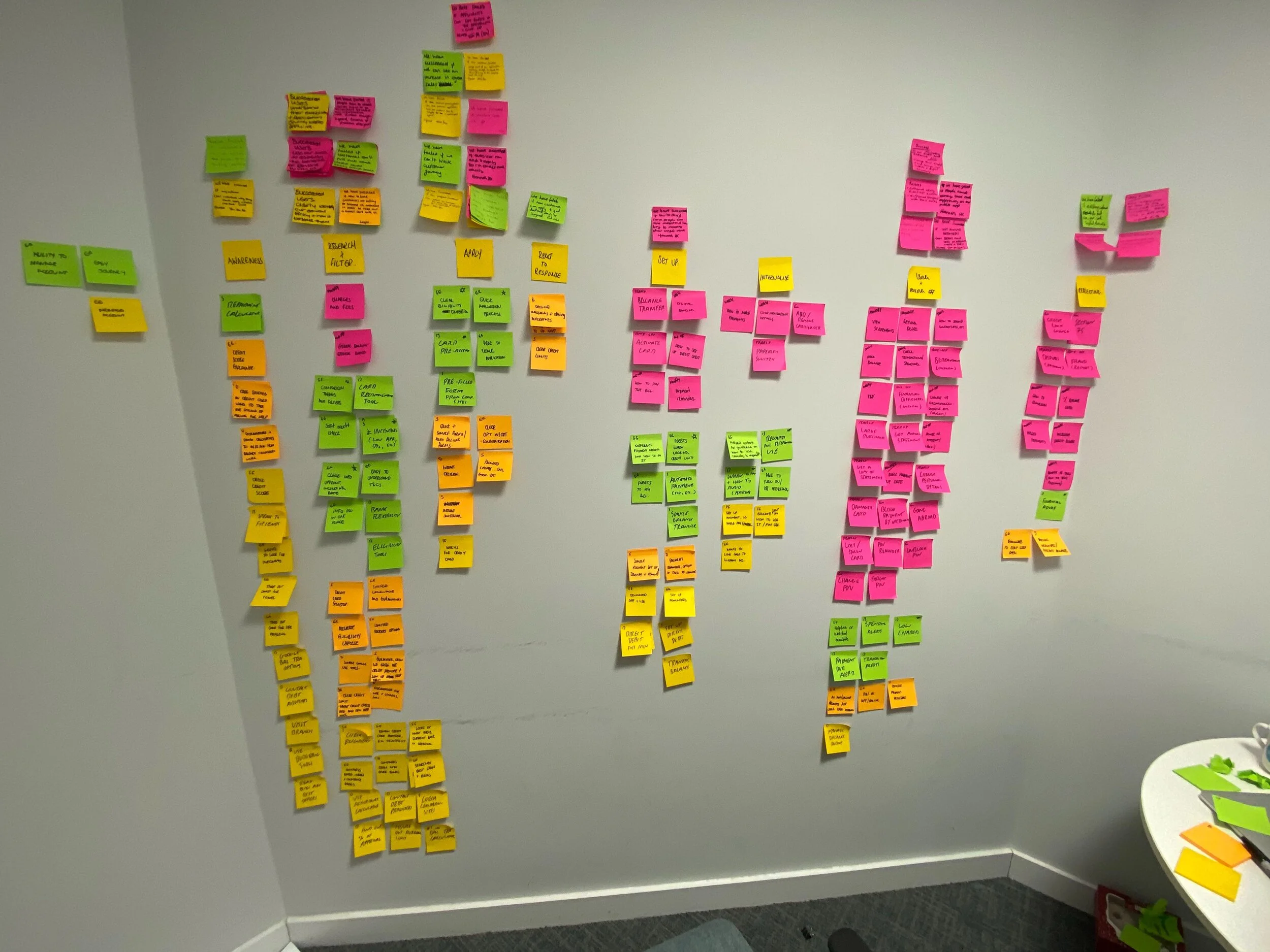
The first was an exercise to have all internal stakeholders map all of their knowledge about the products and journey for a new credit card application or an existing customer onto different user personas, adapted from the Value Proposition Design canvas.
Once we had a group of differentiable users, centred on the tasks they're trying to complete on the site, we mapped our expected experiences onto a set of journey maps. These weren't intended to be final or rigorous - just to find overlaps, patterns and notable gaps in our service from the different perspectives in the room.
The final exercise was created to find out the worries and internal beliefs in different teams. We asked each participant to reflect on their role in relation to the product and think about how they would judge our redesign to be a success or a failure, and then talk the rest of the group through the rationale.
Discovery
The discovery phase was about understanding and grouping differentiable user needs and finding out how competitors and analogous services met those needs.
We began by finding overarching themes and connections between the different personas created in our briefing day, and ended up with a few 'core' assumptions about our users and their needs, as well as their different experiences in applying for and using their credit cards.
Each of these was cross-referenced with user research undertaken in person and online, through Userzoom, facilitated and run by the user researcher on the team.
We also ran collaborative research sessions with colleagues in other digital teams to identify what competitors were doing well (and poorly!) for the key areas in our journey - taking in examples from direct financial services competitors and from industry leaders and expectation-setters in other sectors to measure the level of general expectation across the web in application forms, in help sections, in product pages, etc.
Definition
The definition stage was focused on reaching a long-term vision for where the service could be if we had unlimited resources and weren't constrained by legacy IT or historical decision-making.
After filtering for importance based on our user and competitor research, we mapped out the priorities we should focus on in this definition stage.
We translated each of these needs, benefits and pains into a single page or component - that is, imagined that each of these needs could be met by a single discreet page on the website, with a stated purpose and user need attached.
Together with colleagues from across the business, and after card-sorting relevant fields with users remotely on Userzoom, we grouped components and content together to create whole pages and navigation structures, as well as page level information architecture.
Once we had confidence in what content would be required, and at what level of importance for each user, we undertook a quick content audit of existing work on the site to determine how much work content designers would need to do to get the pages complete, and how long new components in pages would need to be complete.
Each component on each page had a rating of either Good, Bad, OK if it existed already on the site, rated by our content designers and from reviewing prior user tests. If the content was new we rated them as either Short (meaning they could be done within the existing sprint) or Long (meaning they would be pushed into a content sprint later on and reprioritised there.
Derisking
With wireframes at page-level and a sitemap finished, it was time for a more in-depth internal feedback session than our daily check-ins had allowed.
Using a wireframing kit created as part of the Daly design system, we quickly mocked up headings, forms and content outlines for each of the pages we'd created.
Once we had an outline of what would go where, and who it was for, it was time to get more detailed and thoughtful feedback from the broader digital team before it was sent to users to test.
Again, to focus the feedback on user needs and centre people outside the organisation, I created a feedback framework that levelled the playing field between different participants and brought them into user's perspectives immediately.
They were asked to rank each component on three scales - of importance to a given user, of importance to their role if the component were to go missing entirely, and of their confidence in both of the preceding statements.
This meant we had an understanding of collective confidence in given components, and a greater chance at detecting disagreement between our internal assessments and those of other teams - preventing gridlock in the process in future by flagging where different teams needed to talk.
We also used these scores to prioritise user testing. Sorting components by collective confidence gave us an idea of what knowledge already exists; cross-sorting by user importance gave us a list of areas which we had to test with users to make sure our hunches were correct.
As a result, we collected a record amount of internal feedback, with hundreds of comments from dozens of internal stakeholders - saving us dozens of hours of internal conversation and group exercises in filtering out what needs testing, and giving everyone an opportunity to have their perspective heard equally.
Testing & Iterating
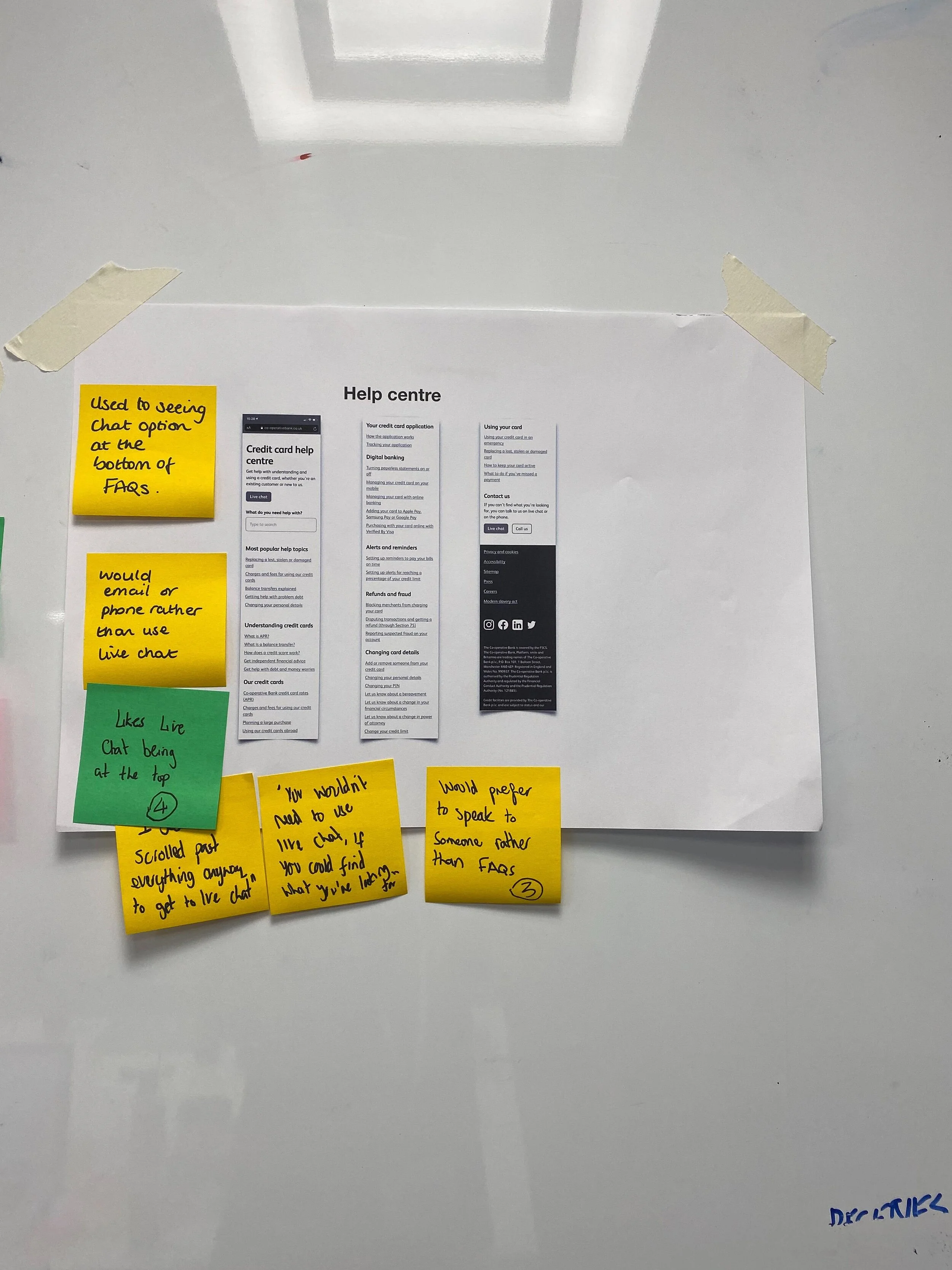
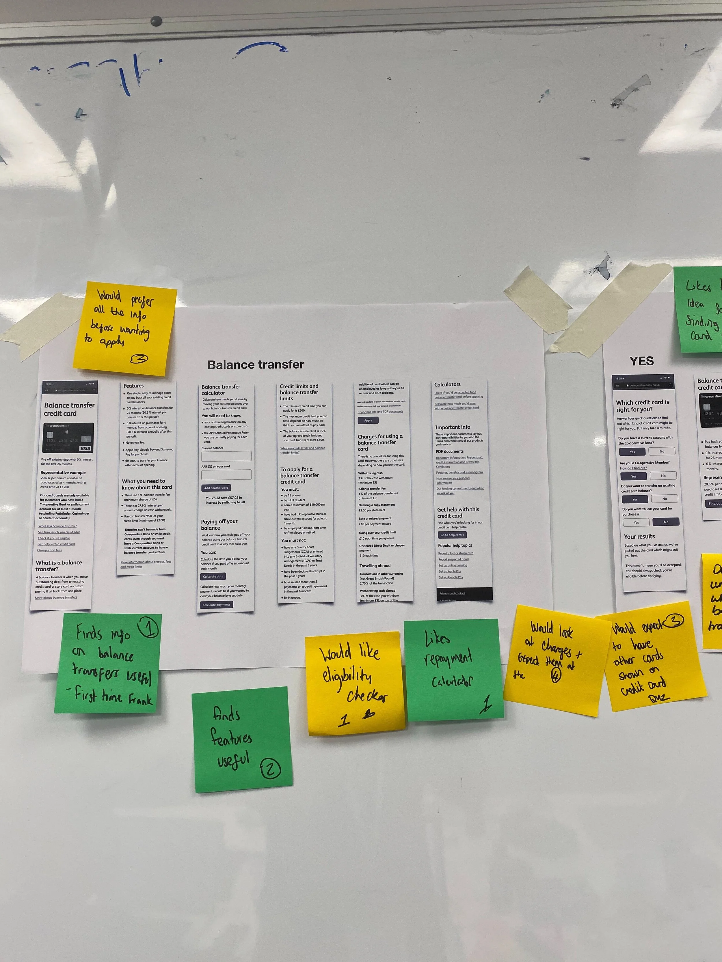
Building around five sets of behaviourally-differentiated personas meant recruiting for in-person user tests was simpler and easier. We arranged for a couple of each type to come in to discuss our work and created test plans for the areas feedback had identified as important to users but where the team lacked the definitive confidence to say to build.
Over the course of five qualitative interviews in our UX lab and over 30 remote tests on Userzoom we got a huge amount of useful feedback on the components, pages and service.
Each phase of iteration took around a day or so, and ended in presentations at our daily check-ins on what changed and why.
Signoff
The final stage is a process of signing off the work and handing it over to relevant development teams.
We ended with a retrospective facilitated by the scrum-master of a development team, to preserve some independence and allow for a more objective reflection.
Based on the feedback from that retro we've already made some changes for the next four-week sprint in the new year, and created a slimmed-down 2-week framework for smaller products.


